Spring dressing has a particular trap built into it. The season arrives and everything suddenly feels possible: pastels, florals, linens in shades that evoke somewhere Mediterranean. The result, more often than intended, is an outfit that looks busy, washed-out, or faintly costumey rather than pulled together. The culprit is rarely the individual pieces. It is the colour combinations.


Expensive-looking clothes share a quality that has nothing to do with price tags: the colours read as intentional. Two or three tones sitting together as though someone actually chose them, rather than picked them from different rails on different days. That quality is learnable. It comes down to understanding which combinations carry weight and which ones cancel each other out.

Camel and Chalk White

Warm neutrals on cool neutrals rarely work. But warm on warm is a different conversation entirely. Camel, that particular shade of amber-tinged tan sitting somewhere between biscuit and toffee, paired with chalk white (slightly warm, never the blue-white of a photocopier) creates a combination that reads as both clean and rich at the same time.

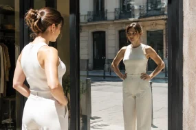
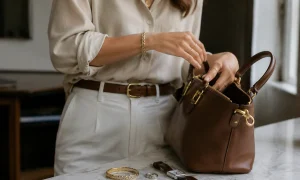
The proportion matters enormously here. A chalk white linen shirt tucked into wide-leg camel trousers, or a full camel coat thrown over a chalk white cotton dress, gives the eye a clear hierarchy. One tone leads; the other supports. When the split is roughly even, the outfit loses that sense of decision. Aim for two-thirds to one-third, and the result suddenly looks considered in a way that costs nothing extra.

What makes this combination feel expensive rather than merely neutral is the warmth running through both tones. They belong to the same family. This is the principle that separates combinations that elevate from combinations that simply avoid clashing.

Stone and Pale Terracotta

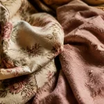
Terracotta has spent several years cycling in and out of trend coverage, but the version that actually works in spring is not the saturated rust of the earthenware pot. It is pale terracotta: a dusty, slightly muted version that sits closer to a washed peach than a burnt orange. Paired with stone, which occupies the grey-beige space between putty and concrete, this combination achieves something genuinely hard to pull off: warmth without effort.

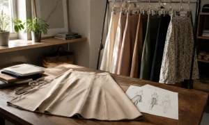
A stone-coloured tailored blazer over a pale terracotta slip dress is one of those combinations that appears in the windows of small independent boutiques and gets attributed to the boutique’s particular taste, when in reality it is just tonal dressing done well. The two shades are close enough in temperature to feel harmonious, different enough in value (one light and greyed, one warm and slightly saturated) to create definition without contrast.

It also layers well with skin tones across the spectrum. The muted warmth of both shades avoids the pallid effect that cooler spring palettes can create, particularly in the flat light of an overcast March afternoon.

Olive and Cream

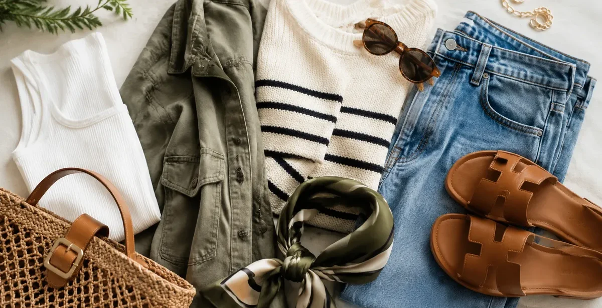
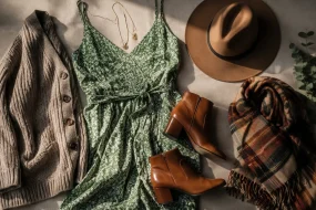
Olive is one of the most underused colours in spring dressing. It tends to be filed under autumnal, which is a shame, because in lighter fabrics and warmer temperatures it does something unexpected: it makes everything around it look more refined. Paired with cream, specifically the slightly yellowed, warm cream of unbleached cotton or ivory silk, it produces a combination that feels botanical without being literal about it.

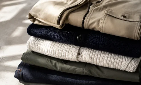
The key is fabric weight and texture. Olive in a heavy gabardine with cream in a chunky knit reads as winter dressing. The same combination in a fine linen shirt and fluid crepe trousers reads as precisely the kind of relaxed elegance that requires, apparently, no effort at all. Spring is a season that rewards lightness, and this pairing works because both colours carry a natural quality, as though they arrived at their shade through sun and air rather than a dye bath.

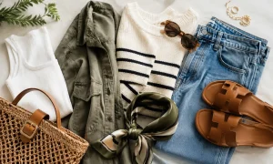
Wide-leg cream trousers with an olive linen shirt half-tucked is the most forgiving version of this combination. It suits a range of body shapes, works on both formal and casual occasions, and photographs exceptionally well in natural light.

Soft Navy and Warm Sand

Navy is everywhere in spring, but most people pair it with white, which creates a nautical effect that feels seasonal in a slightly on-the-nose way. Swap the white for warm sand, a tone one step darker than cream and one step warmer than beige, and the combination immediately shifts register. It stops reading as a theme and starts reading as a wardrobe.

The softness of the navy matters. A very dark, almost-black navy sits in contrast with sand in a way that can feel heavy. A slightly faded or dusty navy, the shade of denim washed many times or indigo kept away from direct light, creates a much more harmonious relationship with the warmth of sand. The contrast is present but not sharp. The eye reads the combination as intentional rather than graphic.

This pairing is also one of the most practical on this list. Sand trousers or a sand skirt with a soft navy blouse, or a sand linen jacket over a navy midi dress, translates across a wide range of occasions from office to weekend without requiring any significant wardrobe surgery. The combination has a quiet authority that justifies reaching for it repeatedly through the season.

Dusty Lilac and Warm Grey

Pastels are the obvious spring move, and most of them go wrong for the same reason: they are paired with stark white or other pastels in combinations that read as either nursery or confectionery. Dusty lilac, a lavender that has been pulled towards grey rather than towards pink, is the one spring pastel that sidesteps this problem when handled correctly.

Paired with warm grey (greige territory, a grey with enough beige in it to sit comfortably near skin), dusty lilac loses its sweetness entirely. The combination reads as almost architectural. A warm grey oversized blazer with a dusty lilac top underneath, or a warm grey wide-leg trouser with a fluid dusty lilac blouse, looks like the kind of outfit that gets attributed to a very good eye rather than a colour theory chart.

What makes the pairing work is the shared quality of mutedness. Both shades have had their saturation dialled back. Neither is trying to be the statement. The result is a combination that feels expensive precisely because it does not announce itself. It rewards closer attention rather than demanding it from across the room.

What These Combinations Share

Sat together, these five pairings reveal a principle that the fashion industry talks around without quite stating plainly: tonal harmony is not about matching. It is about temperature. Every combination here places a warm tone alongside another warm tone, or a muted tone alongside another muted tone. The shades are distinct enough to create definition, but they are drawn from the same thermal register, which is why the eye reads them as deliberate.

Contrast-heavy combinations, a saturated cobalt with a cold white, or a bright fuchsia with ivory, can look striking. They can also look expensive when executed with precision. But they are much less forgiving. A slight variation in shade or proportion and the whole thing can unravel. The combinations above carry their own error-correction. They are, in the most practical sense, the reliable ones.

Spring dressing at its best is a matter of restraint in the colour choices, then freedom in everything else: the silhouette, the proportion, the texture of the fabric. Let the tones sit quietly together, and the rest of the outfit gets room to do its work.

The Question of Accessories

Shoes and bags canundo a well-chosen colour combination faster than almost any other variable. The temptation in spring is to introduce a third colour through accessories, a pop of something brighter to wake the outfit up. Occasionally this works. More often, it interrupts the quiet logic that made the combination look considered in the first place.

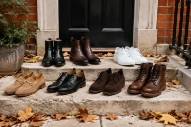
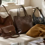
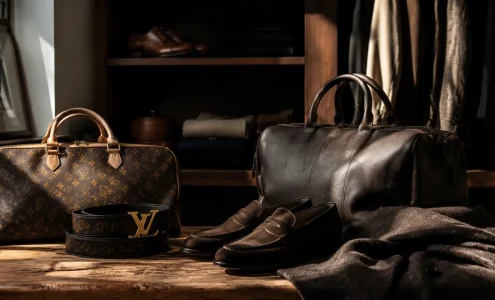
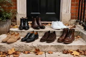
With each of the pairings above, the most reliable accessory approach is to stay within the established palette or to choose a near-neutral that lives in the same temperature zone. Tan leather with camel and chalk white. Cognac leather with olive and cream. A warm-toned metallic, champagne or brushed gold rather than silver, tends to add interest without disrupting the tonal relationship between the two main colours.

A single pair of cognac leather loafers worn with the stone-and-pale-terracotta combination will do more for the overall impression of the outfit than a statement bag in a contrasting colour. The outfit reads complete. It reads as though it belongs to someone who has thought about it, and then stopped thinking about it, which is precisely the effect that makes clothing look expensive rather than effortful.

Leave a Reply

Your email address will not be published. Required fields are marked *