


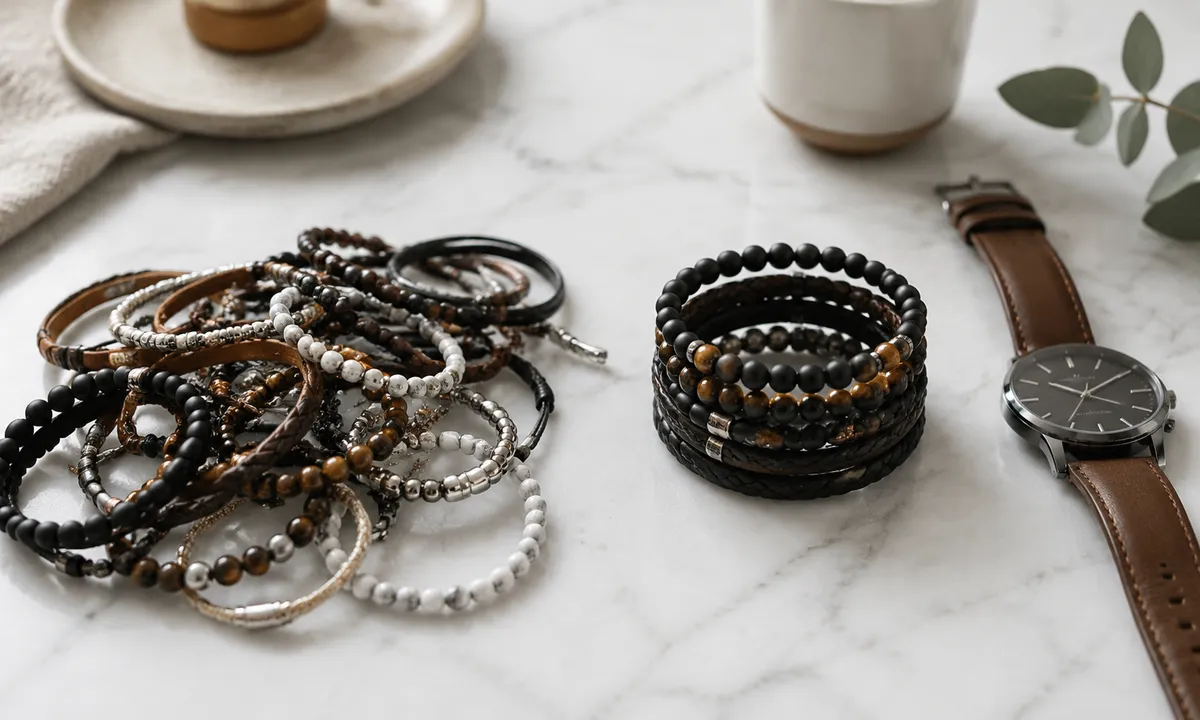
Clutter on the wrist has less to do with how many pieces a person wears and more to do with whether those pieces have any conversation with each other. Three bracelets can look like a deliberate stack. Five can look like someone emptied a jewelry box while running late. The difference is almost never quantity.
The wrist is a small, moving stage. Every time a hand reaches for a coffee cup or gestures mid-sentence, the whole composition shifts and catches light. That motion either reveals a stack that holds together or exposes one that was never really a stack at all, just proximity.
What “Cluttered” Actually Means on a Wrist
Visual clutter on the wrist is a specific problem: too many competing anchors with no hierarchy between them. When a thick leathercuff, a chunky beaded bracelet, a watch with a bold dial, and two chain styles all land at the same visual weight, the eye has nowhere to rest. It just skitters across the whole thing and gives up.
Hierarchy is the fix. One piece should read as the focal point. Everything else supports it. That support can be quiet, just a thin cord or a dainty gold chain, or it can be moderately present, a medium bead, a flat link. But the moment two pieces compete equally for attention, the stack starts to feel chaotic.
Width compounds the problem in a way people underestimate. A 20 mm watch with a 20 mm cuff sitting side by side creates a solid block of coverage from wrist bone to mid-forearm. The wrist disappears. Mixing widths, a broad watch against a 3 mm rope bracelet, lets skin show between the pieces and gives each one room to read as itself.
The Texture Problem Nobody Talks About
Metal against metal can work. Leather against beads can work. The combinations that collapse are the ones where every surface is trying to be interesting at the same time: hammered metal next to faceted stone next to braided cord next to a patterned strap. Each texture calls for attention, and when all of them are equally loud, they cancel each other out rather than add up.
A cleaner principle is to anchor the stack in one dominant texture and let the others echo or contrast it gently. If the watch has a smooth polished case, the bracelets alongside it can introduce one matte texture, one slight sheen, and call it done. The eye reads that as intentional. Four different surface treatments in four centimeters of wrist reads as someone who kept adding without editing.
Stone beads deserve a specific mention because they are genuinely seductive in a shop and genuinely difficult to stack. A 10 mm lapis bracelet is beautiful alone. Next to a watch with a steel bracelet band, it introduces a round, matte, natural texture against flat, reflective, industrial geometry. That contrast can be striking. But add a second stone bracelet in a different stone and suddenly there are two matte orbs competing, neither one finishing its sentence.
How Metal Mixing Goes Wrong
Mixing gold and silver has been rehabilitated as a rule in the last decade, and fairly so. The old prohibition was too rigid. A gold watch can absolutely share a wrist with a silver chain. But there is a version of metal mixing that still fails, and it fails because of proportion rather than color.
When a gold piece and a silver piece are the same visual weight and sit directly adjacent, the eye sees a conflict. It reads as accidental, as though the person put on what was nearby rather than what was considered. The solution is offset: either let one metal clearly dominate the stack, with the other appearing as a minor accent, or separate them with a non-metal element, a cord, a bead, a leather strap, so the transition feels deliberate.
Rose gold is its own complication. It sits between yellow gold and copper on the color spectrum, and when placed next to cool silver it creates a discord that is harder to resolve than the straight gold-silver pairing. Stacking rose gold with yellow gold, by contrast, is forgiving: they are close enough in warmth to read as family.
The Watch as an Anchor, Not an Obstacle
A lot of stacking anxiety comes from not knowing where to place the watch in the logic of the group. Some people avoid stacking with a watch at all, which is a shame, because a watch is often the best anchor a wrist stack can have. It has clear visual weight, a defined shape, and usually a strong material identity. Build around it rather than around it.
The practical rule is simple: match the bracelet metal or material to something already in the watch. A steel case with a steel bracelet band invites more steel or silver chain. A steel case on a tan leather strap opens the door to warmer tones, amber bead, brown cord, a touch of brass. The watch has already made a decision about materials; the bracelets just need to follow that lead rather than introduce a third or fourth language.
Wearing bracelets on both wrists with a watch on one of them is a different question. The simplest approach is to keep the watch wrist relatively restrained, one or two pieces at most, and let the other wrist carry more volume. That way the watch remains legible and the stack on the opposite wrist gets room to be more playful without creating a full arm of noise.
Spacing and Fit Are Doing More Work Than Style
Bracelets that are too loose slide together constantly. They collide, they overlap, they form an unintended pile at the wrist bone whenever the hand drops. Pieces that fit well and have a small amount of intentional room, enough to move but not enough to bunch, hold their relative positions through most motion. That is a mechanical fix that costs nothing and changes everything.
Sizing down on beaded and chain bracelets by one notch or one resize is one of the fastest improvements available. Most people buy bracelets at whatever size comes standard or whatever slides on easily and never revisit it. A bracelet that sits 10 or 12 mm above the wrist with room to drift is always going to look more casual and less edited than one that fits with intention.
The gap between pieces matters too. Packing bracelets so tightly they touch eliminates the skin between them and creates that same solid-block problem as matching widths. A few millimeters of visible wrist between each piece gives the eye a break and lets each bracelet declare its edges.
Editing Down Without Losing the Feeling
The fear in editing a stack is that removing pieces will make the wrist look bare or boring. It rarely does. What it usually does is make the pieces that remain look like they were chosen.
A practical method: put everything on, look in the mirror or at a photo, then remove one piece at a time and look again. The moment the stack stops looking like it lost something and starts looking like it got cleaner, stop there. Most people find that threshold two or three pieces earlier than they expected.
The pieces that survive that edit tend to share something: a common material echo, a coherent range of widths, a consistent finish temperature, whether the whole group reads warm or cool. The ones that get removed are usually the ones that were added because they were available, not because they fit the logic that was already forming. A single 6 mm matte onyx bead bracelet, a clean steel watch, and a thin yellow gold chain is a stack. A stack wearing itself. Nothing fighting for the last word.