


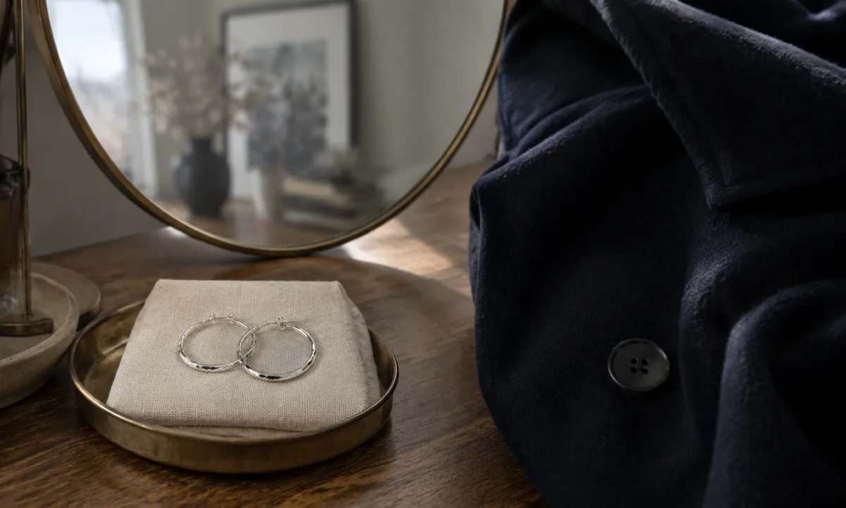
Silver catches light against pale backgrounds the way a brushstroke catches on textured paper: you see every line, every variation, every small imperfection that makes it interesting. Against charcoal wool, against the deep navy of a heavy coat, it simply vanishes.
This is not a matter of taste. It is a matter of contrast ratios, and silver, for all its versatility, has a luminance value that sits close enough to medium-dark surfaces that it functionally disappears from a few feet away. What reads as a beautiful pair of hammered hoops in front of a mirror at home becomes an indistinct glint on a street corner in January.
Why Silver Behaves the Way It Does Against Dark Fabric
Silver reflects diffusely. Unlike mirror-polished gold, which has a warm, directional glow that punches through low-contrast environments, untreated sterling and most silver-finished earrings scatter light across a wide angle. Indoors under good lighting, this quality is exactly what makes them feel sophisticated and soft. Outdoors in winter, under flat overcast skies, it means the earrings throw whatever minimal ambient light exists in all directions at once. None of it is concentrated. None of it has the visual weight to compete with a heavy dark textile.
Dark winter coats compound the problem in a specific way. A coat that rises to the collarbone or frames the neck closely gives the earring almost no neutral space to read against. The face provides some pale contrast, but earrings hang below the cheekbones and beside the jaw, often falling directly in front of coat lapels or scarf fabric. The background they actually sit against, for most observers at normal conversational distance, is the coat itself.
Thick wool, bouclé, heavy tweed: these fabrics also absorb light rather than reflecting it. The combination of an absorptive dark background and a diffuse-reflective silver surface is about the worst possible pairing if the goal is legibility.
The Specific Problem With Small and Delicate Pieces
Size matters here more than people expect. A small silver stud, something 6 or 7 mm across, produces so little total reflected light that it reads as negative space on a dark coat. The eye registers it as a shadow or a button, if it registers it at all. This is why the most enthusiastic recommendations for small silver jewelry almost always involve pale or white backgrounds in the accompanying photographs: ivory linen, cream knitwear, bare skin. Nobody is being dishonest; they just photograph the earring in the conditions where it actually performs.
Thin hoops face a related problem. A fine silver ring has more visual mass than a stud because the eye can follow its circumference, but the wire itself may only be 1 to 1.5 mm thick. Against a navy peacoat at 3 feet, that wire is invisible. What remains is the negative space inside the hoop, which can read as interesting against skin or pale fabric, but against dark wool simply reads as nothing.
This is different from the situation with gold. Yellow gold has a warmer, higher-saturation hue that creates chroma contrast with dark neutrals even when lightness contrast is low. It does not just reflect light; it shifts the color temperature of what it reflects. Silver has no equivalent hue advantage. It is neutral by definition, which is precisely why it works so well in so many contexts and why dark neutrals are the one context where it struggles.
What Actually Works: Scale and Surface Treatment
The earrings that survive a dark coat well share two characteristics: enough physical size that their surface area generates a meaningful amount of reflected light, and some form of texture or geometry that creates internal contrast within the piece itself.
A large hammered disc earring, 30 to 40 mm, works because the irregular surface creates micro-shadows and micro-highlights. The piece has visual depth even when ambient light is flat. A smooth polished disc of the same size produces a single flat reflection that can look washed out. The texture is doing structural work.
Chandelier styles and any earring with open metalwork, cut-out sections, or dangling elements, work through a different mechanism. They move. Even small movements of the head cause the piece to shift relative to light sources, and that motion draws the eye in a way that static pieces cannot. Against a dark coat in winter light, movement is often more effective than size.
Oxidized silver, blackened silver, or silver with a patinated finish introduces exactly the kind of internal contrast that makes jewelry legible at a distance. An earring with dark recessed areas and bright raised areas has contrast built into its own surface. The coat stops being the competition because the earring is already competing against itself. This is why oxidized silver tends to photograph and read well in dark, moodier editorial contexts, while bright polished silver is almost always shown against light backgrounds.
Using the Coat Collar as a Design Element
Most people think about earrings in isolation, but what a collar does to the background changes everything. A wide lapel on a dark overcoat creates a V of exposed skin or pale sweater at the neck, and earrings that hang long enough to appear within that V suddenly have the contrast they need. The same earrings worn with a turtleneck or a coat buttoned to the throat are entirely back in dark-background territory.
A cream or oatmeal scarf worn loose enough to create a pale halo around the neck and jaw is one of the most reliable ways to rescue small silver earrings from invisibility. This is less about accessory coordination as an aesthetic choice and more about solving a perceptual problem. The scarf creates a local background. The earrings now read against pale fabric instead of dark wool, and the contrast is restored.
The positioning of the earring relative to where the coat ends also matters. A drop earring long enough to hang below the coat’s collar entirely, below where the dark fabric frames the jaw, will read against the scarf, the neck, or whatever lighter element is beneath it. A short stud that sits at the earlobe sits precisely in front of the coat collar at most necklines. Two similar earrings, same metal, same finish, same size, will read completely differently depending on where the coat’s edge falls.
The Role of Skin Tone in Winter Light
Winter light is cooler and lower in intensity than summer light, and it changes how silver reads against different skin tones. Against fair or cool-toned skin, silver in winter light reads as harmonious but can become ghostly, a light-against-light combination with not enough contrast on either end to make the earring pop. Against medium or deep skin tones, the contrast between the metallic surface and the skin itself is more pronounced, but if the coat is behind the earring rather than the face, skin tone becomes a secondary factor anyway.
This is also why silver tends to perform better in interior light, where warm artificial sources give it a slightly yellow cast and where backgrounds are lighter, walls, pale shirt collars, interior spaces. The problem really concentrates in outdoor winter settings: low angle light, overcast skies, dark coats that are worn because the weather demands them.
Stones and Mixed Materials Change the Equation
A silver earring with no stone is competing purely on reflective luminance against a dark background. Add a stone, and the rules shift considerably. Turquoise, coral, labradorite, any stone with strong chroma or its own internal light, brings color contrast into the equation. Chroma contrast works even when lightness contrast fails.
Labradorite is a specific case worth noting. The spectral flash it produces, blues and greens that shift with movement, behaves similarly to the movement advantage of chandelier styles. The stone generates its own visual event independent of how much ambient light it receives. Against a dark coat in flat January light, a labradorite set in silver will hold attention when a plain silver piece would not.
White stones, white topaz, moonstone, white freshwater pearls set in silver, provide lightness contrast directly. A pearl stud is pale against dark fabric in a way that a silver stud is not, because the pearl’s white or cream surface has genuinely high luminance. The setting is silver; the color value doing the perceptual work is the pearl. The same logic applies to moonstone, which has the added advantage of its own inner glow in low light conditions.
When Polish Level Makes the Difference
Mirror-polished silver, the kind that produces a hard, direct reflection rather than a soft diffuse one, performs differently against dark backgrounds than brushed or matte finishes. The directional reflection from a high-polish surface catches specific light sources: a streetlight, a bright window, an overhead lamp. In those moments it can produce a strong visual signal even against a dark coat. The disadvantage is that outside those specific directional moments, it disappears more completely than a textured piece would. A brushed silver earring is consistently medium-visible. A mirror-polished piece alternates between invisible and striking depending on where the light is.
In predictable indoor environments with consistent overhead lighting, mirror polish is the stronger choice for visibility. In the unpredictable outdoor winter context, a hammered or otherwise textured surface is more reliable because it is catching light from multiple angles simultaneously and will almost always have some portion of its surface producing a visible reflection.
The earring that survives December reliably is rarely the simplest, smoothest piece in the collection. It is the one with enough surface complexity to find its own light, whatever direction that light happens to come from.