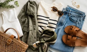
Denim is one of those fabrics that hoards credibility. It has been worn on ranches, in factories, on runways, and in detention, which means a denim jacket arrives with enough visual weight that the colors around it actually matter. The wrong pairing and the jacket looks like an afterthought. The right one and the whole outfit snaps into focus in a way that feels almost effortless, even though it absolutely isn’t.

These seven combinations are not theoretical. Each one earns its place because of the specific tension or harmony it creates with medium-wash indigo, the most common and versatile denim jacket in circulation. A few also work with raw selvedge or a faded light wash, and those exceptions are worth noting. But medium indigo is the starting point.
White and Raw Denim: The One Everyone Knows, Done Right
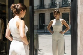
A crisp white shirt under a denim jacket is the most frequently photographed combination in street style for a reason. The contrast is clean, the logic is immediate, and it works in a way that takes almost no effort to read. The trouble is that most people stop at “white shirt” and forget that the weight and texture of that white layer is doing real work. A thin cotton Oxford reads preppy and soft. A heavier white canvas shirt or a structured white crewneck reads like an actual statement.
The underrated upgrade here is wearing the denim jacket over a white mock-neck sweater in January. The extra collar height creates a layered geometry that a T-shirt cannot. Winter light flatters it. The combination is not trying to be clever, and that restraint is the whole point.
Camel and Tan: How Warm Neutrals Fix the Jacket’s Cool Bias
Denim is a cold color. Even a relatively warm medium-wash sits on the blue side of the spectrum, which means pairing it with another cool tone (gray, slate, pale blue) doubles down on something that can read as chilly or flat in person. Camel and tan flip that dynamic entirely.
A camel wool trouser under a denim jacket hits a register that feels genuinely considered. The warmth of the tan pulls the indigo toward a friendlier, more approachable range of the color wheel. Add a white tee between the two layers and you have three tones that build from warm to cool in a logical sequence from bottom to top. This combination photographs well, travels well, and does not look like it required a stylist.
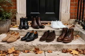
Tan leather also fits here. A tan suede Chelsea boot with dark jeans and a denim jacket is a reliable combination that has held up for decades. The suede texture interrupts the rigidity of the denim without fighting it.
Army Green: Two Workwear Fabrics That Refuse to Compete
Army green is one of the few colors that sits comfortably next to denim without either tone trying to win. Both come from workwear traditions. Both are built around utility rather than ornament. That shared origin means they coexist with a kind of ease that more formal color combinations never quite achieve.
The pairing that works best is an army green cargo pant or chino under a medium-wash jacket, with a gray or oatmeal knit in between as a buffer. The green and the blue are different enough in value and warmth that they do not blur into each other. They read as two distinct pieces, which is what you want. If the tones are too close, the result looks like a failed attempt at a monochromatic outfit. Space them out with that middle layer and the contrast becomes intentional.
Burgundy: The Color That Makes Denim Look Intentional
This one requires a little conviction because burgundy (or oxblood, or deep wine, pick the name that matches your particular shade) is bold enough that wearing it wrong is obvious. But getting it right pays back more than most combinations on this list. A burgundy crew-neck sweater under a medium indigo jacket is rich in a way that gray or navy simply aren’t. The red undertones in the burgundy pull the indigo toward something almost jewel-like.
Burgundy leather sneakers or Chelsea boots extend the color downward without being matchy. The rule, if there is one, is to let the burgundy sit in one place and keep everything else neutral. Black trousers or dark indigo jeans give the combination somewhere to settle. Try to add more than one warm accent and it tips into chaos quickly.
Mustard Yellow: Controlled Risk That Pays Off in Autumn
Mustard yellow is not easy. It is the kind of color that works brilliantly in the right context and looks like a mistake in the wrong one. The right context for a denim jacket is fall, specifically the three-month window when the ambient light shifts and warm earth tones stop looking aggressive and start looking correct.
A mustard wool scarf looped loosely over a denim jacket is the low-commitment entry point. It introduces the color without asking the wearer to commit a full piece of clothing to it. A mustard turtleneck under the jacket is the bolder version, and it works best against dark trousers and dark boots, so the yellow stays contained and does not scatter across the whole outfit. The jacket functions as the anchor, denim’s inherent neutrality keeping the mustard from tipping into costume.
Slate Gray and Charcoal: The Tonal Pairing People Keep Underestimating
Gray and denim can look flat if both pieces are the same value. The specific version that works is a deliberate spread: a light-to-mid slate gray knit or chore coat layered over or under a medium-wash jacket, with charcoal trousers anchoring the bottom. Three different grays, three different textures, and the indigo functioning as a hinge between the warmer and cooler ends of the palette.
This combination benefits from texture more than almost any other pairing on this list. A ribbed slate sweater reads entirely differently from a smooth slate bomber, even at the same color. The ribbing catches light and creates depth, which is what prevents the outfit from collapsing into a gray-blue fog. Get the textures right and this combination looks precise and considered. Ignore texture and it just looks like someone got dressed in the dark.
Rust Orange and Terra Cotta: The Unexpected Pair That Earns Every Compliment
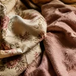
Of everything on this list, rust orange sits farthest from what most people would reach for first. That gap is exactly where it gets interesting. Rust and terra cotta are warm, earthen, almost dusty tones that look extraordinary next to medium indigo because they create a complementary contrast without resorting to anything loud or obvious. Blue and orange sit across from each other on the color wheel. Denim blue and rust are muted versions of that pairing, which means the energy is present but controlled.
A terra cotta linen shirt or a rust-colored knit works here. So does a pair of rust suede loafers against dark trousers under a medium-wash jacket. The key is that the rust needs room to be seen. Bury it under layers or crowd it with competing warm tones and you lose the effect. Keep the outfit simple, let the rust surface, and the denim jacket suddenly looks like it was chosen on purpose, because it was.
Faded light-wash denim handles this pairing slightly differently. Against a pale blue jacket, rust reads even warmer, almost like a desert photograph. That version leans more casual, more sun-bleached, and works best with loose silhouettes rather than tailored ones. The combination is different enough from the medium-wash version that it is almost its own pairing, one that rewards anyone willing to try both and compare.