


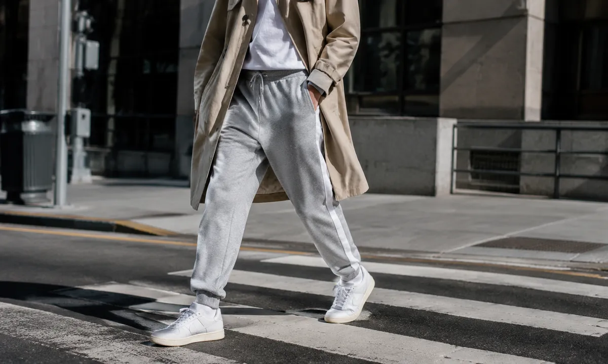
Sweatpants with elastic ankles, a drawstring waist, and a stripe down the leg have been a staple of athletic wear for decades. They were designed to move in, to get sweated through, to get tossed in a gym bag. The question of how to wear them outside that context, in a way that reads as deliberate and considered rather than reluctant, is genuinely interesting because it requires understanding why they look unintentional in the first place.
The problem is almost never the sweatpants themselves. It is the visual logic around them.
Fit Is the Whole Argument
Sporty sweatpants come in a range of silhouettes, and most people grab whichever pair is most comfortable without thinking about what that silhouette is actually doing to a look. A jogger with a tapered ankle and a fitted seat reads completely differently from a wide-leg fleece pant with a sloppy rise. Both are sweatpants. One signals intention on sight.
The tapered, slim-ankle style is doing specific visual work: it gives the outfit a bottom edge. The eye lands somewhere. Wide-leg styles can work too, but they demand a cleaner, more structured top to provide what the pant is not providing on its own. The error most people make is pairing a wide, shapeless pant with an equally wide, shapeless sweatshirt. The result looks like someone dressed in the dark, and not in an interesting way.
Length matters more than most people realize. Sweatpants that pool at the ankle or bunch unevenly on a shoe create a kind of visual noise that signals the wearer did not think about this. A clean break at the ankle bone, or a slight crop above it, makes the whole thing sharper. Hemming a pair of sweatpants costs less than most people’s morning coffee and is possibly the highest-return alteration in casual dressing.
The Shoe Carries More Weight Than You Would Expect
A clean leather sneaker or a structured loafer next to a tapered sweatpant is a specific, legible choice. It says the wearer knows exactly what contrast they are working with. A beat-up running shoe in the same configuration says the whole outfit fell into place by accident, which is a different message.
This is where the concept of intentional contrast becomes practical. Low-profile sneakers in white, cream, or black with a clean sole, whether canvas, leather, or suede, bring an unexpected formality to the ankle. That small formality lifts the sweatpant. A leather loafer, particularly a penny loafer or a chunky-soled version, does it even more dramatically. The slight oddness of the pairing is exactly what makes it work: it shows the person thought about it.
Slides and sandals work when the overall palette is deliberate. A neutral sandal in a warm tone next to a charcoal or olive sweatpant reads as an intentional color decision rather than a failure to locate socks. Chunky dad sneakers can go either way: they add visual weight at the ankle that can look very considered or very sloppy depending on everything else in the outfit. They are a higher-stakes choice than they appear.
What Happens Above the Waist
The top is where most sweatpants outfits lose the argument before it even starts. A relaxed pant needs a top that is doing some structural work. This means something with a defined shape, a visible texture, or a clear silhouette. A fitted ribbed crewneck in a neutral tone is almost a guaranteed solution. A crisp button-down shirt, untucked or half-tucked, carries enough formality to offset the relaxed pant without looking like someone accidentally walked out of the office.
A graphic tee works when the graphic is actually interesting, meaning it has a specific reference or visual quality that suggestscuration rather than a bin at a chain store. A plain white tee can be the right call when the rest of the outfit is doing enough: interesting footwear, a layered jacket, a considered color story. The plain white tee is not a lazy choice if everything around it is specific.
One of the cleaner moves in sweatpants dressing is a structured outer layer: a tailored blazer, a leather jacket, a wool overcoat. This is not a new idea, but it persists because it actually works on a visual logic level. The structured layer gives the outfit a fixed point, something with clear lines and intention, and the relaxed pant reads as an interesting counterpoint rather than the absence of effort.
Color and the Risk of Monotone
Heather grey is the color most closely associated with sweatpants as a garment category, which means wearing heather grey sweatpants with a heather grey sweatshirt sends a very specific signal. That signal is not fashion. Matching grey on grey reads as a uniform for staying home.
Tonal dressing, where different pieces exist in the same color family but at different values or in different materials, is a real and effective technique. Wearing a charcoal sweatpant with an off-white or cream top, or a deep navy pant with a lighter slate top, creates visual coherence without visual flatness. The eye has something to move between.
Black sweatpants are genuinely easier to dress because black reads as intentional across more contexts than grey does. Olive, burgundy, and deep navy all occupy a similar space. Bright-colored sweatpants, red, cobalt, or yellow, work when the rest of the outfit treats them as the main event: everything else neutral, simple, and clean so the color reads as a decision.
The Stripe Problem (and the Stripe Opportunity)
The side stripe is one of the most polarizing design elements in casual dressing. It is directly borrowed from athletic and track-and-field aesthetics, and that reference can either look current and intentional or dated and accidental depending entirely on execution.
A stripe works when it is a single, clean line in a contrasting color on a well-fitted pant, and when the rest of the outfit leans into rather than away from the athletic reference. Wearing a slim stripe pant with a structured blazer and a clean sneaker acknowledges the sporty origin and frames it deliberately. The stripe becomes a graphic element in the outfit rather than a holdover from a gym session.
Wide multi-stripe styles, particularly those with logo-heavy branding, are harder to style without looking like the outfit is wearing the person. If the stripe is subtle and the fit is good, the origin story becomes irrelevant. If the branding is loud and the fit is loose, the athletic reference is the only story the outfit is telling.
Material Signals Quality Before Anything Else Does
French terry, brushed fleece, technical fabric with a slight sheen: the material a sweatpant is made from communicates something before the cut, color, or styling has a chance to. A well-constructed pair in a heavier weight fabric with clean seams and minimal pilling reads as a considered purchase. A thin, pilling pair from a fast-fashion haul reads as disposable regardless of how the rest of the outfit is assembled.
This is one area where spending more than feels comfortable on a single pair of sweatpants actually makes sense. A well-made pair in a durable material holds its shape after washing, keeps its color longer, and drapes in a way that cheaper fabric simply does not. The difference is visible at a distance. It is the difference between a sweatpant that looks chosen and one that looks like it was left over.
Technical fabrics, nylon blends, ripstop weaves, and track-style pants with a slight gloss belong to a slightly different aesthetic category but follow the same rule: the material has to look like it was selected for a reason. A matte jersey pant and a technical nylon pant suggest entirely different visual worlds. Mixing the logic of one with the logic of the other rarely produces a coherent result.
How Accessories Change the Reading
A structured bag next to a sweatpant outfit is one of the fastest ways to tip the whole thing toward intentional. A leather tote, a boxy canvas bag with clean hardware, or even a well-made nylon shoulder bag brings enough visual structure to anchor the relaxed pant. A gym duffel completes a look that is going to the gym. A nice bag completes a look that is going somewhere else.
Jewelry and eyewear do quiet but consistent work here. A minimal gold chain, a pair of clean silver hoops, or a good pair of sunglasses with a defined frame all carry the message that the person accessorized. That message, however small, registers. It separates someone who assembled an outfit from someone who put on clothes because they were nearby.
Hats follow the same logic as outer layers: a structured cap or a well-shaped beanie adds a layer of intention that a worn-out baseball cap does not. This sounds fussy in the abstract, but the actual visual difference is obvious in practice. The shape of the hat either supports the overall impression or it dilutes it.
The Occasion Question That Never Goes Away
All of this comes down to a clear-eyed understanding of where sweatpants can do this work and where they cannot. A coffee shop, a gallery, a casual dinner, a daytime errand run in a city: these are all contexts where a well-styled sweatpant outfit lands without friction. A formal dinner, a job interview, a situation where the social contract requires a specific kind of dress: sweatpants do not belong there, and no amount of styling changes that.
The most confident sweatpants looks are worn by people who have a clear sense of what kind of occasion they are dressing for and what visual statement they are making within it. The look is not trying to pass for something it is not. It is a sweatpant, styled with thought, worn in a context where a sweatpant styled with thought is exactly right. The person wearing a beautifully cut olive jogger with a crisp white shirt, a leather loafer, and a structured bag to a Saturday morning market is not trying to look like they are wearing trousers. They are making a specific case for the sweatpant, and the outfit is strong enough to win it.